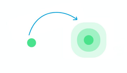
Exemple 1 : Animation pulsée simple
Le code suivant est le code HTML qui permet d'ajouter les informations de base de cette animation pulsée.
Dans le code ci-dessous, nous commençons par créer un élément <div> avec la classe "relative", à l'intérieur duquel nous ajoutons un élément <button> et deux autres élements <div> de classe "span".
Insérer le code ci-après dans le fichier pulse.html :
<!DOCTYPE html>
<!--Simple Pulse Animation-->
<html lang="en">
<head>
    <!--CSS file-->
   <link rel="stylesheet" href="style.css">

</head>
<body>
    <div class="relative">
        <button></button>
        <div class="span"></div>
        <div class="span"></div>
    </div>
</body>
</html>
Ensuite, nous passons aux styles CSS.
Le code suivant est le code CSS qui active cette animation pulsée. Copiez-le et collez-le dans votre fichier CSS - stylee.css.
.relative {
  position: relative;
  margin: 50vh auto;
  width: 60px;
}

.span {
  position: absolute;
  width: 60px;
  height: 60px;
  border-radius: 50%;
  top: 0;
  left: 0;
  border: 0;
  -webkit-animation: sploosh 2s cubic-bezier(0.165, 0.84, 0.44, 1);
  -webkit-animation-iteration-count: infinite;
}

.span:nth-child(2) {
  -webkit-animation-delay: .33s;
  -webkit-animation-duration: 2.2s;
}

button {
  border: 0;
  margin: 50vh auto;
  border-radius: 50%;
  display: block;
  width: 60px;
  height: 60px;
  background-color: rgba(71, 225, 141, 1);
  -webkit-animation: pulse 2s ease-out;
  -webkit-animation-iteration-count: infinite;
}

@-webkit-keyframes sploosh {
  0% {
    box-shadow: 0 0 0 0px rgba(71, 225, 141, .7);
    background: rgba(71, 225, 141, .7);
  }
  80% {
    background: rgba(66, 166, 223, 0);
  }
  100% {
    box-shadow: 0 0 0 120px rgba(66, 166, 223, 0);
  }
}

@-webkit-keyframes pulse {
  0% {
    -webkit-transform: scale(1);
  }
  3.3% {
    -webkit-transform: scale(1.1);
  }
  16.5% {
    -webkit-transform: scale(1);
  }
  33% {
    -webkit-transform: scale(1.1);
  }
  100% {
    -webkit-transform: scale(1);
  }
}
Résultat

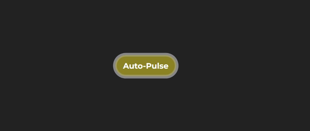
Exemple 2 : Animation pulsée CSS sur un bouton
Dans cet exemple, vous allez créer une animation pulsée sur un bouton à l'aide de CSS. Cela signifie que cet effet d'animation sera ajouté à un bouton.
Dans ce cas, nous allons d'abord créer un bouton et y ajouter quelques animations de base. Ensuite, ajouter l'animation pulsée à l'aide de propriétés CSS.
Nous créons d'abord un bouton auquel on ajoute des animations de changement de couleur. Cela signifie que la couleur de fond du bouton changera dans des conditions normales. Ensuite, l'effet d'animation d'impulsion a été ajouté.
Insérer le code ci-après dans le fichier pulse.html :
<!DOCTYPE html>
<!--Button Pulse Animation-->
<html lang="en">
<head>
    <!--CSS file-->
   <link rel="stylesheet" href="style.css">

</head>
<body>
  <button class="pulse-button">Auto-Pulse</button>
</body>
</html>
Maintenant, vous devez ajouter une animation d'impulsion au bouton avec le CSS suivant. Copiez le code suivant et ajoutez-le à votre fichier CSS.
html{
    display: flex;
    align-items: center;
    justify-content: center;
    height: 100%;
}
body {
    background-color: #222222;
    align-self: center;
    text-align: center;
}

/* Button resets and style */
button {
    margin: 15px auto;
    font-family: "Montserrat";
    border-radius: 100px;
    padding: 15px 20px;
    font-size: 20px;
    color: #ffffff;
    cursor: pointer;
    border: 0px solid #000;
    }

/* Initiate Auto-Pulse animations */
button.pulse-button {
    animation: borderPulse 1000ms infinite ease-out,
               colorShift 10000ms infinite ease-in;
}

/* Declate color shifting animation */
@keyframes colorShift {
    0%, 100% {
            background: #0045e6;
    }
    33% {
        background: #fb3e3e;
    }
    66%{
        background: #0dcc00;
    }
}

/* Declare border pulse animation */
@keyframes borderPulse {
  0% {
    box-shadow: inset 0px 0px 0px 5px rgba(255, 255, 255,.4), 0px 0px 0px 0px rgba(255,255,255,1);
  }
  100% {
    box-shadow: inset 0px 0px 0px 3px rgba(117, 117, 255,.2), 0px 0px 0px 10px rgba(255,255,255,0);
  }
}
Résultat
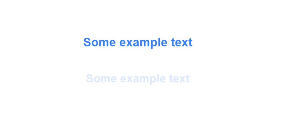
Exemple 3 : Animation pulsée CSS sur du texte
Vous allez maintenant apprendre à ajouter une animation au texte. Car dans de nombreux cas, vous pouvez avoir besoin d'utiliser une animation sur du texte. Il existe plusieurs façons d'animer le texte. Cependant, l'animation pulsée du texte est également utilisée dans de nombreux endroits.
Elle est réalisée de manière très simple. Seules quelques lignes de CSS ont été utilisées pour créer cette animation d'impulsion de texte.
Insérer le code ci-après dans le fichier pulse.html :
<!DOCTYPE html>
<!--Text Pulse Animation-->
<html lang="en">
<head>
    <!--CSS file-->
   <link rel="stylesheet" href="style.css">

</head>
<body>
    <h1 class="element">Some example text</h1>
</body>
</html>
Il est maintenant temps d'implémenter cette animation d'impulsion en joutant quelues styles CSS. Copiez le code ci-dessous et ajoutez-le à votre fichier CSS.
html,
body {
  height: 100%;
  text-align: center;
  margin: 50px auto;
  font-family: sans-serif;
}

.element {
  width: 100%;
  height: 100%;
  animation: pulse 3s infinite;

}

@keyframes pulse {
  0% {
    color: #0682f5;
  }
  50%{
    opacity: 0;
  }
  100% {
    color: #0682f5;
  }
}
Résultat
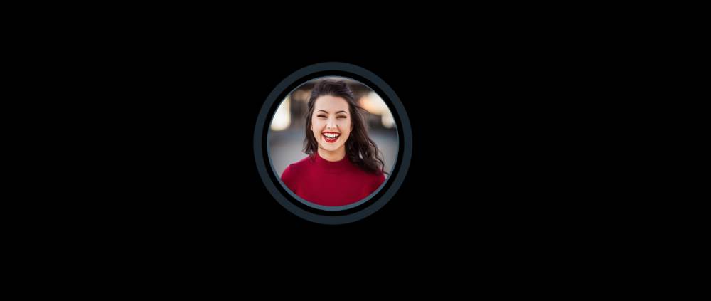
Exemple 4 : Animation pulsée CSS sur une image
Ci-dessus, nous avons ajouté une animation d'impulsion sur du texte, sur un bouton. Maintenant, vous allez apprendre à ajouter une simple animation sur une image.
Il existe de nombreuses façons de rendre une image attrayante. L'effet de survol est l'une d'entre elles. Cependant, en utilisant l'animation pulsée, vous pouvez rendre n'importe quelle image plus attrayante.
Insérer le code ci-dessous dans le fichier pulse.html :
<!DOCTYPE html>
<!--Image Pulse Animation-->
<html lang="en">
<head>
    <!--CSS file-->
   <link rel="stylesheet" href="style.css">

</head>
<body>
   <div class="image-pulse">
      <img src="image.jpg">
   </div>
</body>
</html>
Le CSS ci-dessous permet d'animer votre image en utilisant les sélecteurs ::before et ::after.
body {
    display: grid;
    place-items: center;
    margin: 0;
    height: 100vh;
    background-color: #000;
  }

  .image-pulse {
    --pulse-width: 15px;
    --pulse-color: rgba(135, 200, 235, 0.5);
    position: relative;
  }
  .image-pulse img {
    position: relative;
    border-radius: 50%;
    z-index: 2;
    width: 200px;
    height: 200px;
  }
  .image-pulse::after, .image-pulse::before {
    content: " ";
    position: absolute;
    box-sizing: border-box;
    border-style: solid;
    border-color: var(--pulse-color);
    border-width: var(--pulse-width);
    border-radius: 50%;
    z-index: 1;
    width: 140%;
    height: 140%;
    top: -20%;
    left: -20%;
    right: -20%;
    bottom: -20%;
    transform: scale(0.7);
    animation: pulse 2s linear infinite;
  }
  .image-pulse::after {
    animation-delay: 1s;
  }
  .image-pulse:hover::after, .image-pulse:hover::before {
    animation: pulse 1s linear infinite,
              pulse-hover 5s linear infinite;
  }
  .image-pulse:hover::after {
    animation-delay: 0.5s;
  }
  @keyframes pulse {
    to {
      opacity: 0;
      transform: scale(1);
    }
  }
  @keyframes pulse-hover {
    0% {
      border-color: red;
    }
    25% {
      border-color: #80ff00;
    }
    50% {
      border-color: aqua;
    }
    75% {
      border-color: #8000ff;
    }
    100% {
      border-color: red;
    }
  }
Résultat
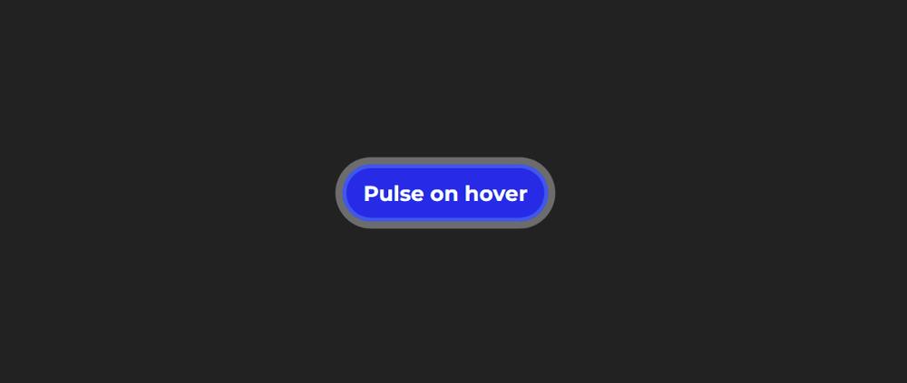
Exemple 5 : Animation pulsée CSS au survol
Vous avez vu dans l'exemple 2 comment animer un bouton. À présent, vous allez apprendre à ajouter une animation pulsée sur un bouton lorsque le curseur de la souris passe dessus ou lorsque l'utilisateur clique sur le bouton.
Insérer le code ci-dessous dans le fichier pulse.html :
<!DOCTYPE html>
<html lang="en">
<head>
    <!--CSS file-->
   <link rel="stylesheet" href="style.css">

</head>
<body>
    <button class="pulse-button-hover">Pulse on hover</button>
</body>
</html>
De la même manière que dans l'exemple 2, nous créons d'abord un bouton. Ensuite, nous y appliquons uelques propriétés CSS et pour finir, ajoutons l'animation au survol ou lorsque l'utilisateur clique sur le bouton.
Ci-après, le code CSS qui vous permet d'ajouter une animation au survol ou lorsque l'utilisateur clique sur le bouton.
html{
    display: flex;
    align-items: center;
  justify-content: center;
    height: 100%;
}
body {
    background-color: #222222;
    align-self: center;
    text-align: center;
}

/* Button resets and style */
button {
    margin: 15px auto;
    border-radius: 100px;
    padding: 15px 20px;
    border: 0px solid #000;
    font-family: "Montserrat";
    font-size: 20px;
    color: #ffffff;
    cursor: pointer;
    }

/* Initiate color change for pulse-on-hover */
button.pulse-button-hover {
    animation: colorShift 10000ms infinite ease-in;
}

/* Continue animation and add shine on hover */
button:hover,
button:focus {
    animation: borderPulse 1000ms infinite ease-out,
            colorShift 10000ms infinite ease-in,
            hoverShine 200ms;
}

/* Declate color shifting animation */
@keyframes colorShift {
    0%, 100% {
            background: #0045e6;
    }
    33% {
        background: #fb3e3e;
    }
    66%{
        background: #0dcc00;
    }
}

/* Declare border pulse animation */
@keyframes borderPulse {
  0% {
    box-shadow: inset 0px 0px 0px 5px rgba(255, 255, 255,.4), 0px 0px 0px 0px rgba(255,255,255,1);
  }
  100% {
    box-shadow: inset 0px 0px 0px 3px rgba(117, 117, 255,.2), 0px 0px 0px 10px rgba(255,255,255,0);
  }
}

/* Declare shine on hover animation */
@keyframes hoverShine {
    0%{
        background-image: linear-gradient(135deg, rgba(255,255,255,.4) 0%, rgba(255,255,255,0) 50%, rgba(255,255,255,0) 100%);
    }
    50%{
        background-image: linear-gradient(135deg, rgba(255,255,255,0) 0%, rgba(255,255,255,.4) 50%, rgba(255,255,255,0) 100%);
    }
    100%{
        background-image: linear-gradient(135deg, rgba(255,255,255,0) 0%, rgba(255,255,255,0) 50%, rgba(255,255,255,.4) 100%);
    }
}
Résultat
Dans ce tutoriel, vous avez appris à créer un effet d'animation pulsée avec CSS. À présent, vous savez comment ajouter une animation à un bouton, au texte et à une image en utilisant du CSS.